Amazing Graph Proves Poverty Doesn’t Matter!(?)
I just couldn’t pass this one up. This is a graph for the ages, and it comes from a presentation by the New Jersey Commissioner of Education given at the NJASA Commissioner’s Convocation in Jackson, NJ on Feb 29. State of NJ Schools presentation 2-29-2012
Please turn to Slide #24:
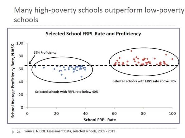 The title conveys the intended point of the graph – that if you look hard enough across New Jersey – you can find not only some, but MANY higher poverty schools that perform better than lower poverty schools.
This is a bizarre graph to say the least. It’s set up as a scatter plot of proficiency rates with respect to free/reduced lunch rates, but then it only includes those schools/dots that fall in these otherwise unlikely positions. At least put the others there faintly in the background, so we can see where these fit into the overall pattern. The suggestion here is that there is not pattern.
The apparent inference here? Either poverty itself really isn’t that important a factor in determining student success rates on state assessments, or, alternatively, free and reduced lunch simply isn’t a very good measure of poverty even if poverty is a good predictor. Either way, something’s clearly amiss if we have so many higher poverty schools outperforming lower poverty ones. In fact, the only dots included in the graph are high poverty districts outperforming lower poverty ones. There can’t be much of a pattern between these two variables at all, can there? If anything, the trendline must be sloped up hill? (that is, higher poverty leads to higher outcomes!)
Note that the graph doesn’t even tell us which or how many dots/schools are in each group and/or what percent of all schools these represent. Are they the norm? or the outliers?
So, here’s the actual pattern:
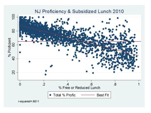 Hmmm… looks a little different when you put it that way. Yeah, it’s a scatter, not a perfectly straight line of dots. And yes, there are some dots to the right hand side that land above the 65 line and some dots to the left that land below it.
BUT THE REALITY IS THAT FREE/REDUCED LUNCH ALONE EXPLAINS ABOUT 2/3 OF THE VARIATION IN PROFICIENCY RATES ACROSS SCHOOLS!
Do free/reduced lunch rates explain all of the variance? Of course not. Nothing really does, in part because the testing data themselves include noise, and reducing the testing data to percentages of kids over and above arbitrary thresholds introduces other noise. So all of the variance can’t be explained no-matter how many variables we throw at it. We can, however, take some additional easily accessible variables from the school report cards and explain a little more of the variation:
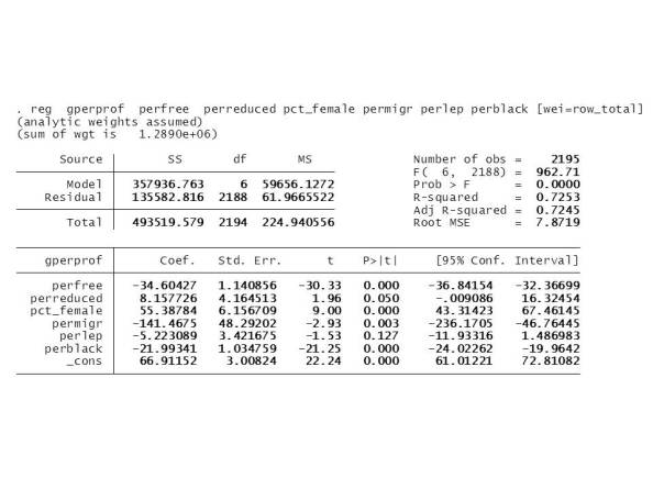 But, % free lunch remains the dominant factor, along with % black and % female. Combining free/reduced produces a somewhat weaker effect than using % free alone.
Lengthy, somewhat related tangent
Back in 2007-2008, while I was still at the University of Kansas, I was involved in a study of factors associated with production of outcomes and relative efficiency of New Jersey schools. Most of the data were generally insufficient for academic publication, but we did have some fun playing and figuring out what was there.
The study was designed to figure out a) which background factors really accounted for differences in NJ school performance, and b) what were the differences in characteristics of schools that appeared to do better or worse than expected.
Here are a few snapshots of what I found back then, constructing models of school level outcomes for New Jersey schools using data from 2004 to 2006 (all publicly accessible data).
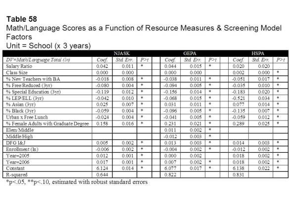 First, using a combination of background demographic factors, school characteristics and other school resource measures we were able to explain as much as 82% of the variation in 8th grade (then GEPA) outcomes. Still, % free and reduced lunch played a (the) dominant role, along with other related factors including special education shares, racial composition, % of female adults living in the surrounding area holding a Graduate degree, and an indicator that the school was in an affluent suburban district (DFG I or J).
We played around with multiple options and this is where we ended up. One of the more interesting revelations was that poverty seemed to have stronger effects on outcomes in population dense urban centers (our Urban x Free Lunch interaction term). This finding is common and can be explained in multiple ways (I’ll have to get to that another time).
We also found that certain resource measures were associated with higher (or lower) outcome schools. Schools where teachers had higher salaries than other similar teachers (by degree and experience) in the surrounding labor market tended to have higher outcomes. And schools with larger shares of teachers in their first three years with only a BA had lower outcomes.
We (I) actually took the analyses a step further and estimated preliminary models of the costs of producing desired outcome targets (models which I subsequently improved upon). The key element of these models was to figure out if there were, in fact, alternative or additional demographic measures for districts that might help to better capture which districts have legitimately higher costs of achieving desired student outcomes. That is, what kind of stuff should be weighted, and/or weighted more heavily in the state school finance formula. Specifically, what alternatives do we have for addressing poverty?
This was the first attempt:
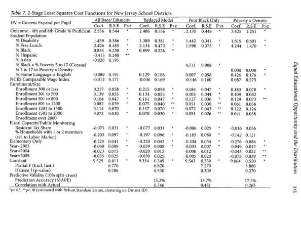
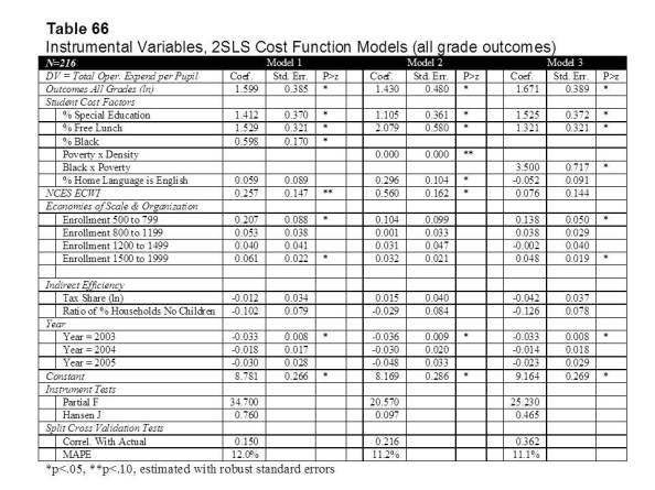 And this was the second attempt (in a published article):
- Baker, B.D., Green, P.C. (2009) Equal Educational Opportunity and the Distribution to State Aid to Schools: Can or should racial composition be a factor? Journal of Education Finance 34 (3) 289-323
What we found was that poverty (measured by % free lunch) indeed strongly affects the costs of improving student outcomes, specifically applied to New Jersey districts, in one case focusing only on K-12 unified districts and in the second case all NJ districts. This finding is not a revelation.
We also found that one might capture additional “costs” by including measures of school district racial composition, and we discuss the legal implications of this finding in several related articles (here, here &here). But, we also point out that there are alternatives for capturing some of the same effect, including the Urban x Poverty interaction.
So yes, we can make our statistical models and analyses ever more nuanced to more thoroughly explain the links between student backgrounds and student outcomes, and the costs of improving those outcomes. And, to the extent we can, we should. But the fact is that poverty still matters, and it seems to matter statistically even when we measure it with the imperfect, crude proxy of children qualified for free or reduced price lunch.
In summary, despite the apparent brilliant wisdom conveyed in the graph at the outset of this post:
- Poverty as measured by free and reduced lunch status remains a very strong predictor of variations in proficiency rates across New Jersey schools; and
- Various measures of poverty, including free lunch status, and census poverty rates interacted with urban population density strongly influence the costs of improving outcomes across New Jersey school districts (and to an extent that far exceeds the weights in the current school finance formula).
But it’s still a really fun graph!
Here’s a link to a related article on schools supposedly “beating the odds” (like those in the above graph)
And here’s a link to my preliminary analyses which never saw the light of day (rough and unedited, in its original draft form): BAKER.DRAFT.JUNE_08
This blog post has been shared by permission from the author.
Readers wishing to comment on the content are encouraged to do so via the link to the original post.
Find the original post here:
The views expressed by the blogger are not necessarily those of NEPC.
