The Non-Reformy Lessons of KIPP
We’ve all now had a few days to digest the findings of the most recent KIPP middle school mega-study. I actually do have some quibbles with the analyses themselves and the presentation of them, one of which I’ll address below, but others I’ll set aside for now. It is the big picture lessons that are perhaps most interesting.
I begin this post with a general acceptance that this study, like previous KIPP studies, and like studies of charter effectiveness in markets generally characterized by modest charter market share and dominance of high flying charter chains, typically find that the kids attending these charters achieve marginal gains in math, and sometimes reading as well (as in the new KIPP study). These findings hold whether applying a student matching analysis or lottery based analysis (though neither accounts for differences in peer group).
In the past few years, we’ve heard lots of talk about no excusesness and its (supposed) costless (revenue neutral) effectiveness and potential to replace entire urban school systems as we know them (all the while reducing dramatically the public expense). But the reality is that what underlies the KIPP model, and that of many other “high flying” no excuses charter organizations, are a mix of substantial resources, leveraged in higher salaries, additional time – lots of additional time (and time is money) and reasonable class sizes, coupled with a dose of old-fashioned sit-down-and-shut up classroom/behavior management and a truckload of standardized testing. Nothin’ too sexy there. Nothin’ that reformy. Nothin’ particularly creative.
The brilliant Matt DiCarlo of Shanker Blog shared with me this quote in e-mail exchanges about the study yesterday:
In other words, the teacher-focused, market-based philosophy that dominates our public debate is not very well represented in the “no excuses” model, even though the latter is frequently held up as evidence supporting the former. Now, it’s certainly true that policies are most effective when you have good people implementing them, and that the impact of teachers and administrators permeates every facet of schools’ operation and culture. Nonetheless, most of the components that comprise the “no excuses” model in its actual policy manifestation are less focused on “doing things better” than on doing them more. They’re about more time in school, more instructional staff, more money and more testing. I’ve called this a “blunt force” approach to education, and that’s really what it is. It’s not particularly innovative, and it’s certainly not cheap.
Expanding on Matt’s final comment here, our report last summer on charter schools found specifically that the costs of scaling up the KIPP model, for example, across all New York City or Houston middle schools would be quite substantial:
Extrapolating our findings, to apply KIPP middle school marginal expenses across all New York City middle school students would require an additional $688 million ($4,300 per pupil x 160,000 pupils). In Houston, where the middle school margin is closer to $2,000 per pupil and where there are 36,000 middle schoolers, the additional expense would be$72 million. It makes sense, for example, that if one expects to find comparable quality teachers and other school staff to a) take on additional responsibilities and b) work additional hours (more school weeks per year), then higher wages might be required. We provide some evidence that this is the case in Houston in Appendix D. Further, even if we were able to recruit an energetic group of inexperienced teachers to pilot these strategies in one or a handful of schools, with only small compensating differentials, scaling up the model, recruiting and retaining sufficient numbers of high quality teachers might require more substantial and sustained salary increases.
But, it’s also quite possible that $688 million in New York or $72 million in Houston might prove equally or even more effective at improving middle school outcomes if used in other ways (for example, to reduce class size). Thus far, we simply don’t know.
Baker, B.D., Libby, K., & Wiley, K. (2012). Spending by the Major Charter Management Organizations: Comparing charter school and local public district financial resources in New York, Ohio, and Texas. Boulder, CO: National Education Policy Center. Retrieved [date] from http://nepc.colorado.edu/publication/spending-major-charter.
Here’s a link to my rebuttal to the rather disturbing KIPP response to our report.
In a recent paper, I continue my explorations of the resource (and demographic) differences of charter schools and their urban contexts. In particular, I’ve been trying to get beyond just looking at aggregate per pupil spending and instead, digging into differences in tangible classroom resources. Here are some related findings of my current paper co-authored with Ken Libby and Katy Wiley.
Baker.Libby.Wiley.Charters&WSF.FEB2013
Finances
Table 5 shows the regression results comparing the site based spending per pupil of charters by affiliation, with New York City district schools serving similar populations, the same grade levels and in the same borough. When comparing by % free or reduced lunch, where KIPP schools are more similar to their surroundings, KIPP schools spent about $4,800 more per pupil. When comparing by % free lunch alone, where KIPPs have lower rates than many surrounding schools, KIPP schools spent more than $5,000 more per pupil.

Table 6 shows similar analysis for the Houston Texas area, including schools in surrounding districts which overlap Houston City limits. Splitting KIPPs by those that serve elementary grades (Iower) versus those serving middle (and some upper) grades, This table shows that KIPPs serving lower grades spent marginally less than district schools. KIPPs serving middle/upper grades spent over $3,000 per pupil more.

Specific Resource Inputs
This figure shows the relative salaries of teachers, both on an annual basis and equated for months on contract in New York City. KIPP teachers at same degree and experience level were paid about $4,000 more than district teachers. Equating contract months KIPP teachers were paid about the same as district teachers. But the central point here is that KIPP teachers were paid more for the additional time. That said, it would appear that teachers in some other NYC charters were paid even more than KIPPs at same degree and experience level.
Figure 1. Relative Salaries in New York City

Here’s a plot of teacher salaries by experience level in Houston Texas. KIPP teachers across the range of experience receive a substantial salary premium for their time and effort.

Figure 2. Relative Salaries in Houston
As I’ve said before. This simply makes sense. This is not a critique. These graphs are constructed with publicly available data – the New York State Personnel Master File and the Texas equivalent. I would argue that what KIPP schools are doing here is simple and logical. They are providing more time to get kids further along and they are acknowledging through their compensation systems that if you want to get sufficient quality teachers to provide that additional time, you’re going to have to pay a decent wage.
Finally, here’s a plot of the relative class sizes in New York City, also constructed by regression analysis accounting for location and grade range.
Figure 3. Relative Class Sizes in New York City

An “are you kidding me?” moment
There was one point in reading the KIPP report that my head almost exploded. This was where the authors of the report included a ridiculously shoddy analysis in order to brush off claims of cream-skimming. In figure ES.1 of the report, the authors make the argument that it is clear that KIPP schools are not cream-skimming more desirable students by comparing KIPP student characteristics to those of all students in the schools from whence the KIPP students came.
Figure ES.1. The Non-Proof of Non-Creamskimming

The authors are drawing this bold conclusion while relying on but a handful of extremely crude dichotomous characteristics of students. They are assuming that any student who falls below the 185% income threshold for poverty is equally poor (whether in Arkansas or New York). But many of my prior analyses have shown that even if we take this dichotomous variable and make it, say, trichotomous, we may find that poorer kids (<130% income threshold) are less likely to sort into charter schools (more below). It is equally if not even more problematic to use a single dummy variable for disability status – thus equating the charter enrolled child with speech impairment to the district enrolled child with traumatic brain injury. The same is likely true of gradients of language proficiency.
The problems of the crudeness of classification are exacerbated when you then average them across vastly disparate contexts. IT WOULD BE ONE THING if the authors actually threw some caveats about data quality and available and moderated their conclusions on this basis. But the authors here choose to use this ridiculous graph as the basis for asserting boldly that the graph provides PROOF that cream-skimming is not an issue.
Look, we are all often stuck with these less than ideal measures and must make the best of them. This example does not, by any stretch make the best of these inadequate measures. In fact, it makes them even worse (largely through their aggregation across disparate contexts)!
An Alternative look at Houston and New York
I don’t have the data access that Mathematica had for conducting their study. But I have, over time, compiled a pretty rich data set on finances of charter schools in New York and Texas from 2008 to 2010 and additional information on teacher compensation and other school characteristics. Notably, I’ve not compiled data on all of the KIPP charters in California, or all of the KIPP charters in Arkansas, Oklahoma, Tennessee or elsewhere. I’ve focused my efforts on specific policy contexts. I’ve done that, well, because… context matters. Further, I’ve taken the approaches I have in order to gain insights into basic resource differences across schools, within specific contexts.
The following two tables are intended to make a different comparison than the KIPP creamskimming analysis. They are intended to compare KIPP, and other charter schools in these city contexts with the other schools serving same grade level students. That is, they are intended to compare the resulting peer context, not the sending/receiving pattern. It’s a substantively different question, but one that is equally if not far more relevant. I use regression models to tease out differences by grade range and within New York City, by location.
Table 3 shows that KIPP schools have relatively similar combined free/reduced lunch shares to other same grade schools in New York City (in the same borough). But, Table 3 also shows that KIPP schools have substantively lower % free lunch share (13% lower on average, but with individual schools varying widely). Table 3 also shows that KIPP schools have substantively lower ELL (11% fewer) and special education (3% fewer) populations in New York City.
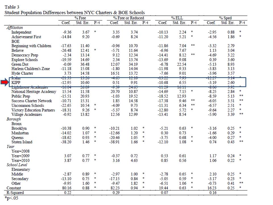
Table 4 shows the results for the Houston area, and this is why context is important to consider. While I would argue that New York City KIPPs do show substantial evidence of income related cream-skimming as well as ELL and special education, I can’t say the same across the board in Houston. Then again, I don’t have the free/reduced breakout in Houston. In Houston, the KIPPs do have lower total special education (and I’m unable to parse by disability type – which is likely important). KIPP middle schools in Houston appear to have higher free/reduced lunch share than middle schools in/around Houston.

Differences between Houston and New York and for that matter every other KIPP context are masked by aggregation across all contexts, yet these differences may be relevant predictors of differences in KIPP success that may exist across these contexts.
Note that Houston and New York are non-trivial shares of the total KIPP sample. Here’s my run of KIPPs by state and by major city, using the NCES Common Core of Data 2010-11.


This blog post has been shared by permission from the author.
Readers wishing to comment on the content are encouraged to do so via the link to the original post.
Find the original post here:
The views expressed by the blogger are not necessarily those of NEPC.