When Real Life Exceeds Satire: Comments on ShankerBlog’s April Fools Post
Yesterday, Matt DiCarlo over at Shankerblog put out his April fools post. The genius of the post is in its subtlety. Matt put together a few graphs of longitudinal NAEP data showing that Maryland had made greater than average national gains on NAEP and then asserted that these gains must therefore be a function of some policy conditions that exist in Maryland. In the Post-RTTT era, Maryland has been the scorn of “reformers” because it just won’t get on board with large scale vouchers and charter expansion and has resisted follow through on test-score based teacher evaluation. Taking a poke a reformy logic, Matt asserted that perhaps the low charter share and lack of emphasis on test score based teacher evaluation… along with a dose of decent funding might be the cause of Maryland’s miracle!
Of course, these assertions are no more a stretch than commonly touted miracles in Texas in the 1990s, Florida or Washington DC, most of which are derived from making loose connections between NAEP trend data and selective discussion of preferred policies that may have concurrently existed. The difference is that Matt was poking fun at the idea of making bold, decisive, causal inferences from such data. Such data raise interesting questions.
What I found so fun and at the same time deeply disturbing about Matt’s post is that the assertions he made in satire… were nowhere near as absurd as many of the assertions made in studies/reports, etc. I discussed here on my blog over the years. Here are but a few examples of “stuff” presented as serious/legit policy evidence, that make Matt’s satirical assertions seem completely reasonable.
The Many Variations of Money Doesn’t Matter Graphs:
I start with this one, because there are so many versions of it floating around out there, that come and go over time, and are often used to advance the “money doesn’t matter”… we’ve spent ourselves into bankruptcy and gotten nothing for it… graph. Every good reformer has a laminated copy of one version or another of this graph which they carry in wallet-size.
I blogged about this graph when Bill Gates used it in a HuffPo article.

Gates asserted:
Over the last four decades, the per-student cost of running our K-12 schools has more than doubled, while our student achievement has remained flat, and other countries have raced ahead. The same pattern holds for higher education. Spending has climbed, but our percentage of college graduates has dropped compared to other countries… For more than 30 years, spending has risen while performance stayed flat. Now we need to raise performance without spending a lot more.
Among other things, the chart includes no international comparison, which becomes the centerpiece of the policy argument. Beyond that, the chart provides no real evidence of a lack of connection between spending and outcomes across districts within U.S. States. Instead, the chart juxtaposes completely different measures on completely different scales to make it look like one number is rising dramatically while the others are staying flat. This tells us NOTHING. It’s just embarrassing. Simply from a graphing standpoint, a blogger at Junk Charts noted:
Using double axes earns justified heckles but using two gridlines is a scandal! A scatter plot is the default for this type of data. (See next section for why this particular set of data is not informative anyway.)
Not much else to say about that one. Again, had I used an example this absurd to represent reformy research and thinking, I’ d have likely faced stern criticism for mis-characterizing the rigor of reformy research!
This alternate version comes to us from none other than Andrew Coulson of Cato Institute. Coulson has a stellar record of this kind of stuff. So, what would you do to the Gates graph above if you really wanted to make your case that spending has risen dramatically and we’ve gotten no outcome improvement? First, use total rather than per pupil spending (and call it “cost”) and then stretch the scale on the vertical axis for the spending data to make it look even steeper. And then express the achievement data in percent change terms because NAEP scale scores are in the 215 to 220 range for 4th grade reading, for example, but are scaled such that even small point gains may be important/relevant but won’t even show as a blip if expressed as a percent over the base year.

Chris Cerf’s Poverty Doesn’t Matter Graph!
Now, it’s one thing when and under-informed tech CEO goes all TED-style on us with big screens, gadgets, bells and whistles and info-graphics that just don’t mean crap anyway. But, it’s yet another when a State Commissioner of Education presents something not only equally ridiculous… but arguably far more ridiculous, disingenuous, unethical and downright WRONG.
This is a graph for the ages, and it comes from a presentation by the New Jersey Commissioner of Education given at the NJASA Commissioner’s Convocation in Jackson, NJ on Feb 29. State of NJ Schools presentation 2-29-2012

The title conveys the intended point of the graph – that if you look hard enough across New Jersey – you can find not only some, but MANY higher poverty schools that perform better than lower poverty schools.
This is a bizarre graph to say the least. It’s set up as a scatter plot of proficiency rates with respect to free/reduced lunch rates, but then it only includes those schools/dots that fall in these otherwise unlikely positions. At least put the others there faintly in the background, so we can see where these fit into the overall pattern. The suggestion here is that there is not pattern.
Note: this graph may not even be the worst one in the presentation. You decide!
The apparent inference here? Either poverty itself really isn’t that important a factor in determining student success rates on state assessments, or, alternatively, free and reduced lunch simply isn’t a very good measure of poverty even if poverty is a good predictor. Either way, something’s clearly amiss if we have so many higher poverty schools outperforming lower poverty ones. In fact, the only dots included in the graph are high poverty districts outperforming lower poverty ones. There can’t be much of a pattern between these two variables at all, can there? If anything, the trendline must be sloped uphill? (that is, higher poverty leads to higher outcomes!)
Note that the graph doesn’t even tell us which or how many dots/schools are in each group and/or what percent of all schools these represent. Are they the norm? or the outliers?
Well, here’s what the pattern really looks like with all schools included:

Hmmm… looks a little different when you put it that way. Yeah, it’s a scatter, not a perfectly straight line of dots. And yes, there are some dots to the right hand side that land above the 65 line and some dots to the left that land below it.
Note: New Jersey’s Chris Cerf is not alone among state commissioners in promoting completely bogus analysis posing as empirical validation. In fact, New York’s John King presented a completely fabricated graph provided to him by a consultant to the state and has used that graph to frame his state’s policy initiatives.
Rishawn Biddle’s Graph of, well, something? What?
Not to be outdone, Rishawn Biddle who on occasion fashions himself a “researcher” on education policy issues, provides a graph that comes close to the degrees of intentional deception presented by Commissioner Cerf above. I blogged about this graph here!
In response to arguments I had made on my blog regarding the role of substantive and sustained school finance reforms in improving school quality, Biddle argued:
Despite the arguments (and the pretty charts) of such defenders as Rutgers’ Bruce Baker, there is no evidence that spending more on American public education will lead to better results for children.
My claims are substantiated in this peer reviewed article and this separate more comprehensive report:
- Baker, B. D., & Welner, K. G. (2011). School Finance and Courts: Does Reform Matter, and How Can We Tell?. Teachers College Record, 113(11), 2374-2414.
- Baker, B. D. (2012). Revisiting the Age-Old Question: Does Money Matter in Education?. Albert Shanker Institute. http://www.shankerinstitute.org/images/doesmoneymatter_final.pdf
And what does Biddle provide as counter evidence to this – apparent lack of evidence I summarize above (I’ve sent the article link to Biddle on more than one occasion, but he apparently doesn’t read this kind of academic stuff)?
Biddle counters with a link to this graph – a true gem (I’ve added some annotation, not in his original)!
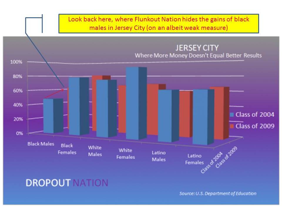
Yes, Biddle’s counter to the body of research he has not and likely will never read, is to use this graph of “promoting power” by student race group for Jersey City, NJ in 2004 and 2009. Note that the infusion of additional funds in NJ occurred mainly from 1998 to 2003, leveling off thereafter. But that’s a tangential point (not really). So, Biddle’s absolute verification that more money doesn’t matter is to simply assert without verification that Jersey City got a whole lot more money and then to use this graph to argue that nothing improved!
First of all, that analysis wouldn’t pass muster in as a master’s degree level assignment (I teach a class on this stuff at that level), no less major research conclusions. From a graphing standpoint, I often criticize my students’ work for what I refer to as gratuitous use of 3d – especially where the use of 3d bars actually obscures the comparisons by making it hard to see where they align on the axis.
But, the really funny if not warped part of this graph is that there appear to be significant gains for black males between 2004 and 2009, but those gains are obscured by hiding the 2009 black male score behind the 2004 black female score.
Note that the graph also contains no information regarding the actual shares of the student population that fall into each group? Not very useful. Pretty damn amateur. Certainly fails to make any particular point, and certainly doesn’t refute the various citations above – all of which employ more rigorous analytic methods, apply to more than a single district, and most of which appear in rigorous peer reviewed journals.
Reason Foundation’s Today’s Policies Affected Yesterday’s Outcomes Study!
Finally, in my years as a reviewer for the National Education Policy Center’s Think Tank Review Project I’ve reviewed a lot of sketchy stuff. Some of it stands out, and has even won Bunkum awards from NEPC.
For example, a recent report from ConnCAN repeatedly footnoted a claim as being substantiated to earlier reports…only to result in a dead end where the claim was never substantiated… and in fact, when checking the data turned out to be patently false! So, this one isn’t even a subtle data interpretation issue. It’s just a lie.
Then there was a report by the organization Third Way, which gathered numerous sources of incompatible data, across incompatible time frames (along with many other bizarre claims) in order to make the argument that America’s middle class schools are failing miserably.
Either of these reports make Matt’s assertions in his post on the Maryland Miracle look totally reasonable!
But for me, the winner among all of the think tank reports I’ve read comes from the Reason Foundation in their 2009 Weighted Student Funding Yearbook! Here’s the abstract of my review:
The new Weighted Student Formula Yearbook 2009 from the Reason Foundation provides a simple framework for touting the successes of states and urban school districts that grant greater fiscal autonomy to schools. The report defines the Weighted Student Formula (WSF) reform extremely broadly, presenting a variety of reforms under the WSF umbrella. Accordingly, when the report concludes that WSF is successful and should be widely replicated, it is difficult to sort through the claims and recommendations. Moreover, the approach and recommendations lack critical inquiry, thought, or empirical analysis. Perhaps most disturbing is the fact that in a third of the specific districts presented in the report, the evidence of success provided predates the implementation of the reforms, and the Reason press release makes the outright claim that past improvements are somehow a function of yet-to-be-implemented reforms. While the report does provide some reasonable recommendations, they are overshadowed by others. Overall, the policy guidance provided by the Reason report is reckless and irresponsible.
Yes… you read it correctly…. If you go through the smashing successes claimed by Reason in this report, in 1/3 of the cases, the reforms in question were implemented after the window of test scores discussed! Hence, the Bunkum time machine award!
Matt’s satirical example didn’t go anywhere near this far.
In Closing….
In my view, there are at least two lessons from Matt’s post, for either side of the reformy aisle.
First, as I so often point out in my classes on applied data analysis, we need to always take time to carefully evaluate what our data – whatever data and whatever measures – can and cannot tell us. The latter is key here. Descriptive data can be very useful… as long as we understand what they can and cannot tell us. For that matter, various types of inferential statistical analyses (regression models) can also be useful (and in policy research are often primarily descriptive), but often don’t tell us what we think or would like them to tell us. I’ll likely write more about this topic in the future.
Second, we all should take time to carefully scrutinize the link between empirical evidence and policy assertions (and many should take time to take some legit graduate level research methods and statistics and measurement courses on these topics if they wish to continue to opine so boldly about policy inferences!). Perhaps most importantly we should actually take more time and put more effort into scrutinizing those reports and claims that appear most agreeable to our own predisposed beliefs/opinions. Everyone has predisposed beliefs (especially those who pretend not to). I would argue that experienced researchers likely have stronger beliefs and opinions… and we should… precisely as a result of years of experience researching specific topics.
Oh… and a third lesson… Don’t make completely BS, false/fabricated/absurd graphs like those above. That’s just ridiculous. Are you kidding me? Hiding 3d bars? (Rishawn?) Deleting most of the cases that define the trend? (Cerf?) That’s just ridiculous! Infuriating! Sickening!
This blog post has been shared by permission from the author.
Readers wishing to comment on the content are encouraged to do so via the link to the original post.
Find the original post here:
The views expressed by the blogger are not necessarily those of NEPC.