Seeking Practical Uses of the NYC VAM Data???
A short while back, in a follow up post regarding the Chetty/Friedman/Rockoff study I wrote about how and when I might use VAM results, if I happened to be in a decision making role in a school or district:
I would want to be able to generate a report of the VA estimates for teachers in the district. Ideally, I’d like to be able to generate a report based on alternative model specifications (option to leave in and take out potential biases) and on alternative assessments (or mixes of them). I’d like the sensitivity analysis option in order to evaluate the robustness of the ratings, and to see how changes to model specification affect certain teachers (to gain insights, for example, regarding things like peer effect vs. teacher effect).
If I felt, when pouring through the data, that they were telling me something about some of my teachers (good or bad), I might then use these data to suggest to principals how to distribute their observation efforts through the year. Which classes should they focus on? Which teachers? It would be a noisy pre-screening tool, and would not dictate any final decision. It might start the evaluation process, but would certainly not end it.
Further, even if I did decide that I have a systematically underperforming middle school math teacher (for example), I would only be likely to try to remove that teacher if I was pretty sure that I could replace him or her with someone better. It is utterly foolish from a human resource perspective to automatically assume that I will necessarily be able to replace this “bad” teacher with an “average” one. Fire now, and then wait to see what the applicant pool looks like and hope for the best?
Since the most vocal VAM advocates love to make the baseball analogies… pointing out the supposed connection between VAM teacher deselection arguments and Moneyball, consider that statistical advantage in Baseball is achieved by trading for players with better statistics – trading up (based on which statistics a team prefers/needs). You don’t just unload your bottom 5% or 15% players in on-base-percentage and hope that players with on-base-percentage equal to your team average will show up on your doorstep. (acknowledging that the baseball statistics analogies to using VAM for teacher evaluation to begin with are completely stupid)
With the recently released NYC data in hand, I now have the opportunity to ponder the possibilities. How, for example, if I was the principal of a given, average sized school in NYC, might I use the VA data on my teachers to council them? to suggest personnel changes? assignment changes, or so on? Would these data, as they are, provide me any useful information about my staff and how to better my school?
For this exercise, I’ve decided to look at the year to year ratings of teachers in a relatively average school. Now, why would I bother looking at the year to year ratings when we know that the multi-year averages are supposed to more accurate – more representative of the teacher’s over time contributions? Well, you’ll see in the graphs below that those multi-year averages also may not be that useful. In many cases, given how much teacher ratings bounce around from year to year, it’s rather like assigning a grade of “C” to the kid who got Fs on the first two tests of the semester, and As on the next two or even a mix of Fs and As in some random sequence. Averages, or aggregations, aren’t always that insightful. So I’ve decided to peel it back a bit, as I likely would if I was the principal of this school seeking insights about how to better use my teachers and/or how to work with them to improve their art.
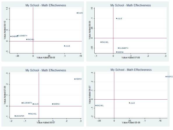
Here are the year to year Math VA estimates for my teachers who actually continue in my building from one year to the next:
 Focusing on the upper left graph first, in 2008-09, Rachel, Elizabeth and Sabina were somewhat below average. In 2009-10 they were slightly above average. In fact, going to the prior year (07-08), Elizabeth and Sabina were slightly above average, and Rachel below. They reshuffle again, each somewhat below average in 2006-07, but only Rachel has a score for the earliest year. Needless to say, it’s little tricky figuring out how to interpret differences among these teachers from this very limited view of very noisy data. Julie is an interesting case here. She starts above average in 05-06, moves below average, then well above average, then back to below. She’s never in the same place twice. There could be any number of reasons for this that are legitimate (different class composition, different life circumstances for Julie, etc.). But, more likely it’s just the noise talkin’! Then there’s Ingrid, who held her own in the upper right quadrant for a few years, then disappears. Was she good? or lucky? Glen also appears to be a tw0-in-a-row Math teaching superstar, but we’ll have to see how the next cycle works out for him.
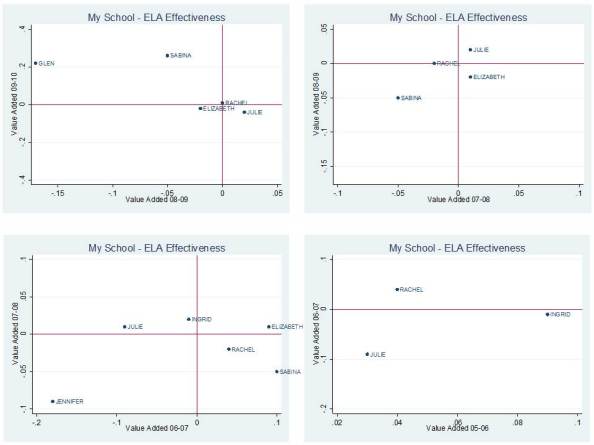
Now, here are the ELA results:
If we accept these results as valid (a huge stretch), one might make the argument that Glen spent a bit too much of his time in 2008-09 trying to be a Math teaching superstar, and really shortchanged ELA. But he got it together and became a double threat in 2009-10? Then again, I think I’d have to wait and see if Glen’s dot in the picture actually persists in any one quadrant for more than a year or two, since most of the others continue to bounce all over the place. Perhaps Julie, Rachel, Elizabeth and Sabina really are just truly average teachers in the aggregate – if we choose to reduce their teaching to little blue dots on a scatterplot. Or perhaps these data are telling me little or nothing about their teaching. Rachel and Julie were both above average in 05-06, with former? colleague (or left the VAM mix) Ingrid. Rachel drops below average and is joined by Sabina the next year. Jennifer shows up as a two-year very low performer, then disappears from the VAM mix. But Julie, Rachel, Sabina and Elizabeth persist, and good for them!
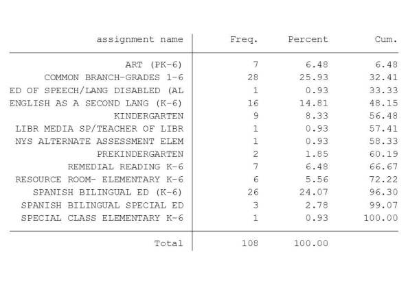
So, now that I’ve spent all of my time trying to figure out if Glen is a legitimate double-threat superstar and what, if anything I can make of the results for Julie, Rachel, Elizabeth and Sabina, It’s time to put this back into context, and take a look at my complete staffing roster for this school (based on 2009-10 NYSED Personnel Master File). Here it is by assignment code, where “frequency” refers to the total number of assigned positions in a particular area:
 So, wait a second, my school has a total of 28 elementary classroom teachers. I do have a total of 11 ELA and 10 Math ratings in 2009-10, but apparently fewer than that (as indicated above) for teachers teaching the same subject and grade level in sequential years (the way in which I merged my data). Ratings start in 4th grade, so that knocks out a big chunk of even my core classroom teachers.
I’ve got a total of 108 certified positions in my school, and I’m spending my time trying to read these tea leaves which pertain to, oh… about 5% of my staff (who are actually there, and rated, on multiple content areas, for more than a few years).
By the way, by the time I’m looking at these data, it’s 2011-12, two years after the most recent value-added estimates and not too many of my teachers are posting value-added estimates more than a few years in a row. How many more are gone now? Sabina, Rachel, Elizabeth, Julie? Are you still even there? Further, even if they are there, I probably should have been trying to make important decisions in the interim and not waiting for this stuff. I suspect the reports can/will be produced more likely on a 1 year lag, but even then I have to wait to see how year-to-year ratings stack up for specific teachers.
From a practical standpoint, as someone who would probably try to make sense of this type of data if I was in the role of school principal (‘cuz data is what I know, and real “principalling” is not!), I’m really struggling to see the usefulness of it.
See also my previous post on Inkblots and Opportunity Costs.
Note for New Jersey readers: It is important to understand that there are substantive differences between the Value-added estimates produced in NYC and the Student Growth Percentile’s being produced in NJ. The bottom line – while the value-added estimates above fail to provide me with any meaningful insights, they are conceptually far superior (for this purposes) to SGP reports.
These value-added estimates actually are intended to sort out the teacher effect on student growth. They try to correct for a number of factors, as I discuss in my previous post.
Student Growth Percentiles do not even attempt to isolate the teacher effect on student growth, and therefore it is entirely inappropriate to try to interpret SGP’s in this same way. SGPs could conceivably be used in a VAM, but by no means should ever stand alone.
They are NOT A TEACHER EFFECTIVENESS EVALUATION TOOL. THEY SHOULD NOT BE USED AS SUCH. An extensive discussion of this point can be found here:
http://schoolfinance101.wordpress.com/2011/09/02/take-your-sgp-and-vamit-damn-it/
http://schoolfinance101.wordpress.com/2011/09/13/more-on-the-sgp-debate-a-reply/
This blog post has been shared by permission from the author.
Readers wishing to comment on the content are encouraged to do so via the link to the original post.
Find the original post here:
The views expressed by the blogger are not necessarily those of NEPC.

